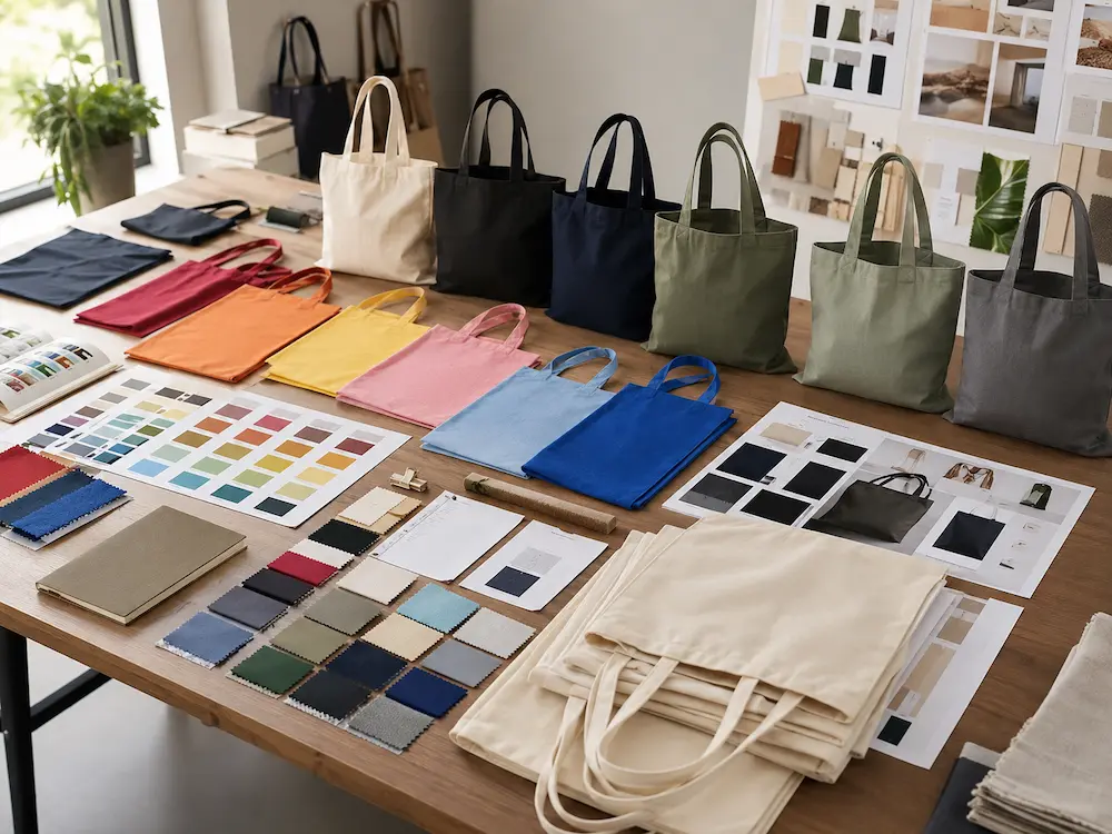
Choosing the right tote bag colour is more important than many brands realise. A tote bag may have good fabric, strong stitching, and a clear logo, but if the colour does not match the brand message or customer lifestyle, the product may not perform well in public use.
Colour affects how people feel about a bag. It influences whether the logo is visible, whether the product feels premium, whether it fits a sustainability story, and whether customers are willing to carry it regularly.
For brands, tote bag colour selection should not be based only on personal preference. It should be based on brand identity, campaign purpose, material choice, printing method, and end-user behaviour.
A good colour makes the tote bag more wearable. A poor colour makes the bag feel like disposable promotion.
Why Tote Bag Colour Matters for Branding
A tote bag is often carried in public. That means the colour becomes part of the brand’s visible identity.
The right colour can:
- Improve logo recognition
- Strengthen brand consistency
- Increase perceived product value
- Encourage repeated use
- Support sustainability messaging
- Improve campaign memorability
The wrong colour can create problems:
- Logo becomes hard to read
- Bag feels too cheap or too loud
- Colour does not match the target audience
- Product becomes less reusable
- Brand message feels inconsistent
For products such as custom logo tote bags for consistent visual identity, colour selection is especially important because the bag must support a recognisable and stable brand image.
Start with Brand Identity First
The first step is reviewing your brand colours.
Most brands already have:
- Primary brand colour
- Secondary colour
- Accent colour
- Logo colour
- Neutral palette
The tote bag should work with these colours rather than compete with them. For example, if your logo is dark green, a natural beige canvas tote may work very well. If your logo is white, a black or navy tote may provide strong contrast. If your brand uses bright orange, a neutral bag colour may help the logo stand out without making the whole product too aggressive.
Brand colour alignment is especially important for custom printed tote bags for impactful brand presence, where the tote bag itself becomes a moving brand asset.
Tote Bag Colour and Brand Positioning
Different colours communicate different meanings.
| Colour Family | Common Brand Impression | Best For |
|---|---|---|
| Natural Beige | Organic, simple, eco-conscious | Sustainability brands, cafés, bookstores |
| Black | Premium, modern, versatile | Fashion, corporate, lifestyle |
| White | Clean, minimal, fresh | Beauty, wellness, creative brands |
| Navy | Professional, stable, trustworthy | Corporate, education, finance |
| Olive Green | Natural, calm, sustainable | Outdoor, organic, wellness |
| Red | Bold, energetic, attention-grabbing | Events, campaigns, retail promotions |
| Blue | Trustworthy, practical, universal | Corporate, schools, healthcare |
| Grey | Neutral, modern, understated | Tech, lifestyle, corporate |
Colour is not decoration. It is brand communication.
Natural Tote Bag Colours
Natural cotton and canvas colours remain extremely popular because they feel simple, reusable, and sustainable.
Common natural tones include:
- Natural cotton
- Beige
- Sand
- Oatmeal
- Stone
- Light khaki
- Unbleached canvas
These colours are widely used for eco-friendly branding, bookstores, organic food brands, coffee shops, wellness companies, and lifestyle retail.
For products such as custom canvas tote bags for sustainable brand impact, natural tones often support the sustainability message better than bright synthetic-looking colours. Natural colours also work well with black, dark green, brown, navy, and muted logo printing.
Black Tote Bags
Black tote bags are popular because they look modern, versatile, and premium.
Advantages include:
- Strong retail appeal
- Easy daily styling
- Less visible staining
- Good for fashion brands
- Works well with white, gold, silver, or bright logos
However, black fabric may require different printing methods or stronger ink opacity to ensure logo visibility.
Black tote bags are especially useful for:
- Fashion retail
- Corporate gifts
- Music merchandise
- Premium events
- Minimalist brands
The key is print contrast. A weak logo on black fabric can disappear quickly.
White and Off-White Tote Bags
White and off-white tote bags create a clean and fresh appearance.
They work well for:
- Beauty brands
- Wellness brands
- Art events
- Creative studios
- Minimalist retail
However, pure white fabric can stain more easily. For practical daily use, off-white, cream, and natural canvas often perform better than bright white. White bags are excellent for colourful artwork, but they may require stronger fabric quality and cleaner finishing because imperfections are more visible.
Earth-Tone Colour Palettes
Earth tones continue to perform well in modern tote bag branding.
Popular earth tones include:
- Olive
- Sage
- Clay
- Sand
- Charcoal
- Rust
- Stone grey
- Warm brown
These colours feel calm, modern, and sustainable without being too plain.
Earth-tone bags are especially effective for brands that want a natural but more differentiated look than standard beige.
They are commonly used in:
- Organic food
- Outdoor lifestyle
- Wellness
- Sustainable fashion
- Coffee and tea brands
- Eco retail
Bright Promotional Colours
Bright colours still have value, especially in short-term promotional campaigns.
Common options include:
- Red
- Yellow
- Royal blue
- Orange
- Bright green
- Pink
Bright tote bags are useful when the goal is visibility, energy, and attention.
They work well for:
- Festivals
- Sports events
- Youth campaigns
- School promotions
- Trade shows
- Public awareness campaigns
However, bright colours can feel less premium if not handled carefully. They are also harder to reuse in everyday outfits. For long-term brand visibility, neutral and earth-tone bags often achieve better reuse.
Colour Selection by Campaign Type
| Campaign Type | Recommended Colours | Why It Works |
|---|---|---|
| Trade Show Giveaway | White, natural, blue, red | High visibility and cost efficiency |
| Retail Merchandise | Black, beige, olive, charcoal | Strong lifestyle appeal |
| Sustainability Campaign | Natural, sage, sand, recycled grey | Supports eco positioning |
| Corporate Gift | Navy, black, grey, natural | Professional and versatile |
| Fashion Launch | Black, off-white, clay, charcoal | Premium and wearable |
| Bookstore Promotion | Natural, forest green, navy | Calm and intellectual |
| Wellness Brand | Cream, sage, beige, light grey | Soft and natural |
| Youth Event | Bright blue, orange, pink, yellow | Energetic and memorable |
A campaign colour should match both the brand and the user environment.
Logo Contrast Is More Important Than Colour Preference
The best tote bag colour is useless if the logo cannot be read clearly.
Logo contrast should be checked before production.
| Bag Colour | Strong Logo Colours |
|---|---|
| Natural Beige | Black, dark green, navy, brown |
| Black | White, gold, silver, bright colours |
| Navy | White, light grey, yellow |
| White | Black, red, blue, green |
| Olive | Cream, white, black |
| Grey | Black, white, navy |
| Red | White, black, cream |
Low-contrast combinations may look subtle in mockups but fail in real life. For example, light beige printing on natural cotton may be too weak. Dark green on black may disappear. White ink on dark fabric may require special print preparation. Always review physical samples when logo visibility matters.
Pantone Matching and Colour Accuracy
Professional brands often require Pantone colour matching. Pantone matching helps ensure the printed logo matches brand guidelines. However, buyers should understand that fabric printing is not the same as paper printing.
Colour appearance can change depending on:
- Fabric texture
- Fabric colour
- Ink type
- Printing method
- Dye absorption
- Lighting conditions
A Pantone colour printed on natural cotton may look slightly different from the same Pantone colour printed on coated paper. This is why sample approval is important before bulk production.
Fabric Colour vs Printed Colour
Brands can achieve colour in two ways:
- Use coloured fabric
- Print colour onto neutral fabric
Each option has advantages.
| Colour Method | Advantages | Limitations |
|---|---|---|
| Coloured Fabric | Strong overall visual identity | May require MOQ and dyeing control |
| Printed Artwork | Flexible and cost-efficient | Limited to artwork area |
| Natural Fabric + Logo | Simple and sustainable | Less colourful overall |
| Full-Panel Print | Strong visual impact | Higher cost and more complexity |
For large orders, custom-dyed fabric may be possible. For smaller orders, stock fabric colours are often more economical.
Colour Selection for Personalised Tote Bags
Personalised tote bags need colour palettes that work across multiple names, graphics, or small-batch variations. Neutral base colours are usually safest because they allow different artwork styles to stand out.
Common base colours include:
- Natural
- Black
- White
- Navy
- Grey
For personalised tote bags for distinct brand expression, colour flexibility is important because every personalised design must still look balanced. Personalisation works best when the base colour does not overpower the artwork.
Colour Trends for Retail Tote Bags
Retail tote bags usually follow lifestyle and fashion trends more closely than simple promotional products.
Current strong retail colours include:
- Natural canvas
- Black
- Cream
- Olive
- Sage
- Charcoal
- Clay
- Stone grey
These colours are popular because customers can pair them easily with daily outfits. A tote bag that fits personal style is more likely to be reused. This is why retail brands often avoid overly bright colours unless the colour is part of a strong seasonal campaign.
Colour Choices for Lightweight Reusable Bags
Not every campaign requires a classic tote bag. Some brands use lightweight reusable formats for events, kits, or portable carry.
For products such as cotton drawstring bags designed for lightweight reusable use, colour choices often need to support portability, youth appeal, and event visibility. Bright colours may work better for sports and school campaigns, while natural cotton works better for eco-focused brands. The same colour logic applies: match colour to use case.
Colour and Packaging Consistency
Tote bag colour should also work with packaging. If your packaging uses kraft paper, natural cotton and earth-tone bags usually fit well. If your packaging is black and premium, black or dark grey tote bags may strengthen the luxury feel.
Brands should consider:
- Bag colour
- Logo colour
- Hang tag colour
- Paper sleeve colour
- Retail display environment
- Website product photography
Colour consistency across the full customer experience improves brand recognition.
Bulk Production and Colour Consistency
Colour consistency becomes more important in bulk orders.
Potential issues include:
- Dye lot variation
- Fabric batch differences
- Ink shade variation
- Slight colour changes after washing
- Different lighting during inspection
For large campaigns, buyers should request:
- Lab dips for dyed fabric
- Pantone references for printing
- Pre-production samples
- Batch approval standards
This is especially important for corporate and retail programmes where colour accuracy affects brand identity.
Cost Impact of Tote Bag Colour Choices
Colour selection can affect cost.
| Colour Choice | Cost Impact |
|---|---|
| Natural Stock Fabric | Lowest |
| Standard Stock Colour | Low-Medium |
| Custom Dyed Fabric | Higher |
| Multi-Colour Printing | Higher |
| Full-Panel Colour Print | High |
| Special Metallic Ink | High |
Natural and stock colours usually offer the best cost control. Custom dyeing may be worthwhile for major brand campaigns but is less efficient for small orders.
Common Colour Selection Mistakes
Choosing Colour by Personal Taste Only
The colour should fit the brand and customer, not just the buyer’s preference.
Ignoring Logo Contrast
Poor contrast reduces brand visibility.
Choosing Trendy Colours Without Longevity
A fashionable colour may feel outdated quickly.
Overusing Bright Colours
Bright colours can reduce daily reuse if they are hard to style.
Skipping Physical Samples
Digital mockups cannot fully show fabric colour, texture, and ink behaviour.
How to Choose the Best Tote Bag Colour
A practical selection process should answer these questions:
| Question | Why It Matters |
|---|---|
| What is the brand colour palette? | Supports visual consistency |
| Who will carry the bag? | Matches user lifestyle |
| Where will the bag be used? | Determines visibility needs |
| What colour is the logo? | Affects contrast |
| Is sustainability important? | Supports natural colour choices |
| Is the order large enough for custom dyeing? | Affects cost |
| Will the colour remain wearable long term? | Affects reuse frequency |
The best colour is the one that supports both brand strategy and customer behaviour.
Conclusion
Tote bag colour selection is a strategic branding decision. Natural tones support sustainability and lifestyle appeal. Black and navy create professional and premium impressions. Bright colours work well for short-term visibility and energetic campaigns. Earth tones offer a modern balance between style and environmental positioning.
For brands, the strongest colour choice is not always the loudest or trendiest option. It is the colour that makes the tote bag useful, attractive, recognisable, and worth carrying again.
How Brands Should Think About Tote Bag Colour Selection
Colour is a branding decision: Tote bag colour affects how customers perceive the brand, how clearly the logo appears, and whether the bag feels suitable for everyday use.
Contrast matters more than preference: A colour may look attractive in isolation but fail if the logo is hard to read. Brands should always evaluate bag colour and logo colour together.
Natural tones support reuse: Beige, cream, olive, grey, and black are often easier for customers to carry regularly because they match daily outfits and feel less promotional.
Production reality matters: Stock fabric colours usually reduce cost and lead time, while custom dyed colours may require higher MOQ, lab dips, and stricter quality control.
The broader takeaway: The best tote bag colour is the one that balances brand identity, customer lifestyle, logo visibility, production feasibility, and long-term reuse. Youngpack supports B2B brands with custom tote bag colour planning, printing guidance, material selection, and export-ready manufacturing.
FAQ
1. What is the best colour for branded tote bags?
Natural beige, black, navy, grey, and olive are among the most versatile colours because they support good logo visibility and long-term reuse.
2. Are bright tote bag colours good for branding?
Bright colours work well for events, youth campaigns, and short-term visibility, but neutral colours often perform better for long-term daily reuse.
3. How do I choose a tote bag colour for my logo?
Choose a bag colour that creates strong contrast with your logo. Dark logos work well on natural or white bags, while white logos work well on black, navy, and dark green bags.
4. Do custom dyed tote bags cost more?
Yes. Custom dyed fabric usually costs more than stock colours because it requires dyeing control, minimum order quantities, and colour matching.
5. Why are natural tote bag colours popular?
Natural colours are popular because they feel simple, reusable, sustainable, and easy to match with everyday outfits.
References
- Pantone Colour Matching and Brand Identity Guide
- Textile Dyeing and Colour Consistency Handbook
- Retail Brand Colour Psychology Research
- Sustainable Textile Design Trends Report
- Promotional Products Colour Selection Guide
- Cotton and Canvas Fabric Printing Manual
- Consumer Lifestyle Product Colour Preference Study
- Retail Merchandising and Visual Identity Standards
Professional Content Notice:
This article is part of the original packaging content developed by Xiamen Youngpack Imp.and Exp.Co.,Ltd. Please respect the originality of the work when sharing or referencing it.